MLB vs. MiLB Strike Zone
Introduction
In August 2022, I attended a Minor League baseball game in Salt Lake City. Since I played baseball for many years and watch a lot of baseball, I feel like I have a pretty good understanding of the strike zone. In the first few innings of the game, I felt like the umpire had a very tight strike zone and was especially not calling high strikes, which I feel had been more commonly called in the majors the last few years. As I discussed what I thought were questionable calls with my friends, someone in the row in front of us reminded us that the automated strike zone was being using in AAA ball.
My friends and I felt a little dumb for complaining about the automated strike zone, but at the same time I couldn’t stop thinking about how I felt like the strike zone seemed small. Since I have been around baseball a lot, I felt that even though the strike zone was automated, it was different from the strike zone that is usually called. I pulled up MiLB Gameday for the game we were at and when I looked at the strike zone, it honestly looked a decent amount different from the MLB strike zone that I pulled up on Gameday for a MLB game. Now, I know that the strike zones aren’t necessary to scale for Gameday, but I was again suspicious about the size of the strike zone.
Background of ABS
Later, I began to search for the size of the automated strike zone. From an article published in The Athletic, “The strike zone extends 19 inches wide at the middle point of home plate, including an inch off either edge (home plate is 17 inches wide). The top and bottom edges of the strike zone are based on specific percentages of the batter’s height. The size of the automated zone, MLB said, is similar to the major-league zone.”1
The automated balls and strikes system (ABS) was implemented in Triple A in May 2022, which was convenient for me because it meant that there was a month of data where the ABS wasn’t used that I could use for comparison. I decided to get pitch data for August 1 - August 15 for both Triple A and MLB games as well as data from April 15 - April 30 from Triple A games. I wasn’t completely sure if the pitch locations were consistent between the different levels, so by taking Triple A data from earlier in the season, I can see if there is a change in the strike zone without worrying about if there are differences in how locations are tracked between levels.
I began by using the baseballr package to collect the data for the time periods of interest. I won’t include all of the code, but I will show a portion of it here as an example. This post from Bill Petti, the author of the baseballr package, provided most of the code needed to extract the data I was interested in. The post provides the different codes to get data from different levels. For MLB, the level_id = 1 and for Triple-A the level_id = 11.
library(baseballr)
x <- map_df(.x = seq.Date(as.Date('2022-08-01'), as.Date('2022-08-15'), 'day'),
            ~get_game_pks_mlb(date = .x, level_ids = c(11)))
safe_milb <- safely(get_pbp_mlb)

df <- map(.x = x %>% filter(status.codedGameState == "F") %>% pull(game_pk),
          ~safe_milb(game_pk = .x)) %>% map('result') %>% bind_rows()
library(tidyverse) # Used for data manipulation
library(CalledStrike) # Used for creating strike zone probability models/grids
library(patchwork) # Combine plots together
library(gt) # Used for tablesAfter all of the pitch data was scraped, I saved it to a file for convenience and then removed any of the pitches where the location of the pitch was not recorded. When plotting the strike zone in the following graphs, the top and bottom of the strike zone is determined by taking the average of the top and bottom across all hitters, which should give a reasonable estimate of where the strike zone is.
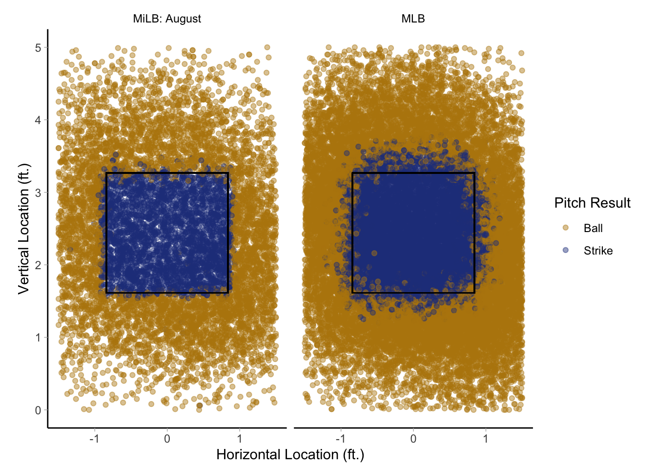
First, I wanted to compare the ABS zone with the MLB strike zone from August since that was where my initial question arose. The first thing I noticed initially is how the ABS strike zone looks very close to a rectangular shape and there is a lot more consistency. The MLB strike zone seems to get strike calls outside of the zone and the area where strikes are called seems to be larger. It also isn’t just a few pitches outside of the zone that are called strikes, but there are many strikes called outside of the zone that it is easily visible on the plot below.
It also seems that the area where strikes are called outside of the indicated strike zone is the largest above the strike zone. One reason for this is that heights will vary from player to player, so a number of those pitches that appear to be outside of the strike zone are likely actually strikes for certain players (such as Aaron Judge). Even with that consideration, it seems that the strike zone (or at least the called strike zone) appears to extend higher than what is called by the ABS.
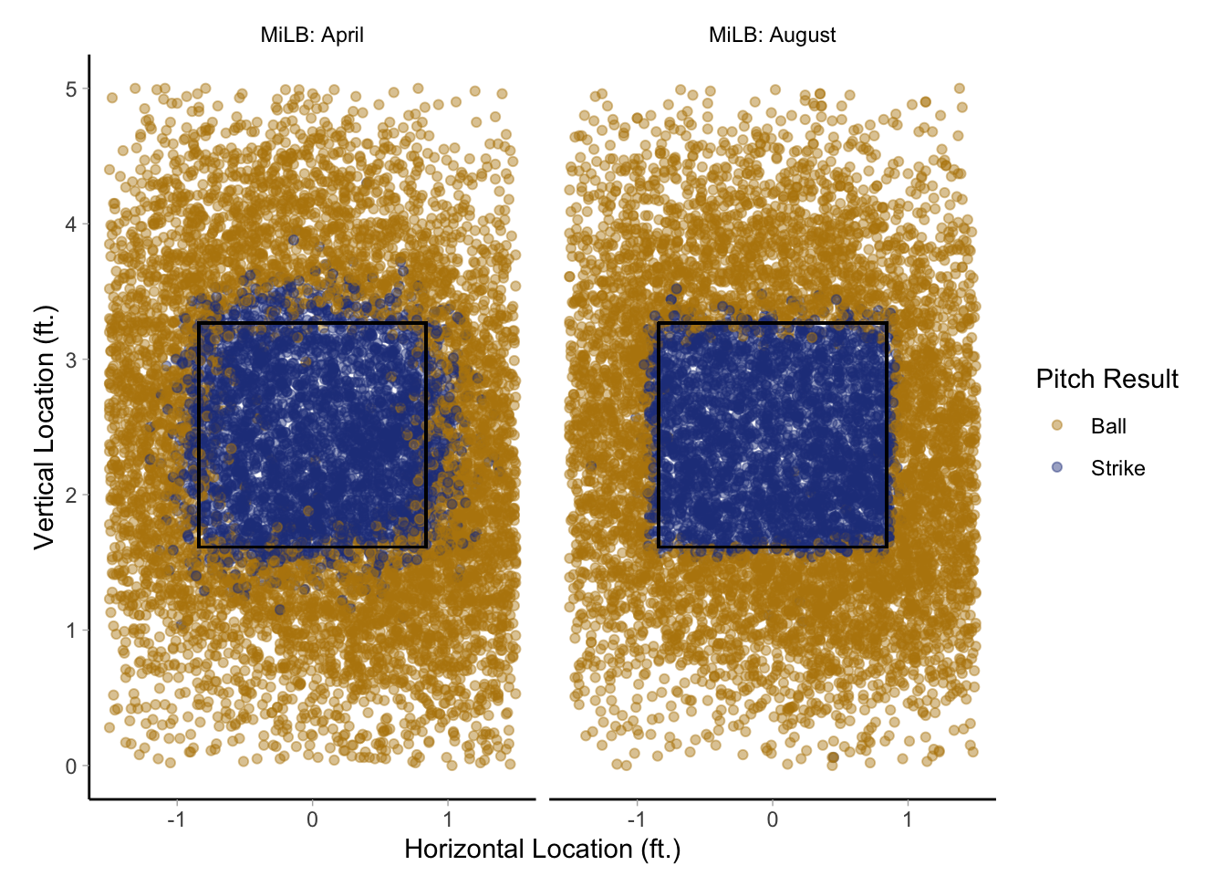
As I mentioned previously, I wasn’t certain if the pitch coordinates are exactly the same between the MLB games and the MiLB games, so I also took data from Triple-A from April when the ABS wasn’t being used. In this case, the pitch coordinates are assumed to be the same since the data is coming from games at the same level.
When comparing the MiLB strike zone across the two periods, the same general pattern that was seen when comparing ABS with the MLB strike zone in August appears. It doesn’t seem like the called strikes in April go as high as the MLB strike zone in August, which I likely think is due to difference in heights. Even with that difference, it appears that the top of the strike zone is the area where the calls change the most when switching to ABS.
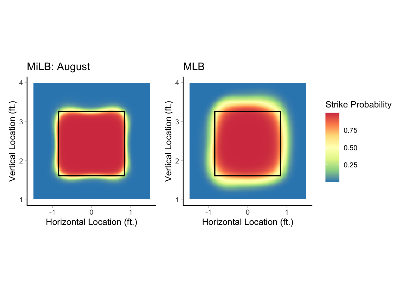
Besides looking at the actual called balls and strikes between strike zones, I thought it would be useful to model the probability of a pitch being a strike based on the pitch location. One common approach to modeling the probability of a pitch being called a strike is generalized additive models (GAMs). While I won’t include the details, a GAM is one statistical approach to modeling non-linear relationships. The location of a pitch and whether or not it is a strike would represent a complex, non-linear relationship, which is why it is used often in this scenario.
As a note, the calledStrike package from Jim Albert can create these probability plots easily. My data was formatted slightly differently, so I used his code to create the plots and adapted it to the format of my data.
When looking at the probability of a pitch being called a strike between the MiLB and MLB strike zone in August, the first thing I notice is that the red area (where a strike is very likely to be called) is a lot larger for the MLB strike zone, especially at the top of the strike zone. The other thing that is interesting to note is that the transition area from a certain strike to a certain ball (red to blue) is a lot wider for the MLB strike zone. This isn’t a surprising result since one of the major benefits of ABS is the consistency, but the plot illustrates the uncertainty of pitches on the edges of the strike zone when a human umpire is making the call.
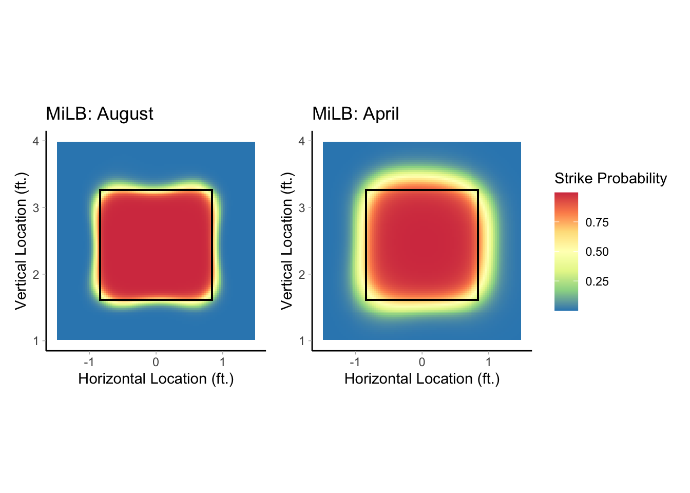
I fit a GAM for the two MiLB strike zones (April and August) and compared them with each other as well. The results are pretty similar to what was seen when comparing the August strike zone for MiLB and MLB. The transition from certain strike to a certain ball (red to blue) is again more drastic for the MiLB strike zone in April when human umpires were making the calls.
One last thing that I wanted to check is the average height of the strike zone in the three different time periods that I looked at. On the figures I’ve shown, the top and bottom of the strike zone were the average across all time periods, but I’ve mentioned that the top and bottom could have been different between leagues due to height differences, etc.
The table below shows the top and bottom of the strike zone in inches for the different times period. There isn’t much of a difference in the bottom of the strike zone with only a half inch difference between MLB and MiLB. There is a decent difference in the top of the strike zone. MLB had a strike zone that was 2 inches higher than the MiLB strike zone in April when they were using human umpires and a 3 inch (almost 3 and a half) difference between the MLB strike zone and ABS. I don’t have the average heights of batters between the leagues to determine if this difference is due to a difference in height or if the ABS strike zone has a lower top of the zone than what was been called before.
| Top of Strike Zone | Bottom of Strike Zone | |
|---|---|---|
| MLB | 40.45 | 19.15 |
| MiLB: April | 38.04 | 19.64 |
| MiLB: August | 37.02 | 19.59 |
| Location is determined by the average of the strike zone locations from Statcast | ||
One reason I think this difference is important and could make a difference is because of how pitchers are pitching now. Fastballs at the top of the strike zone are a common pitch being thrown right now. Even if the ABS isn’t going to be introduced in MLB, it is being used throughout all levels of Minor League Baseball. As prospects are developing, it could be difficult to throw high fastballs as often if the strike zone is lower. If the strike zone is a little lower, then it means hitters can lay off fastballs that they may have previously swung at because they won’t be called strikes or pitches will leave fastballs in the zone that are more hittable because they aren’t as high.
I’m not certain that the differences would continue either. It would be useful to look at this comparison again with data from the beginning of the 2023 season and see if these differences still exist or not.
If you have any questions about what I have done or would like to see the code for this analysis, feel free to reach out to me. Email is always the best point of contact for me, but you can reach out via any of the provided links in my bio.